Business Cards Design Sydney: Tips and Examples for Your Business
In the bustling Sydney metropolis, the right business card can set the stage for lasting professional relationships, encapsulating the essence of your brand with a mere glance:
Our designs transcend mere contact information; they communicate quality and heritage.
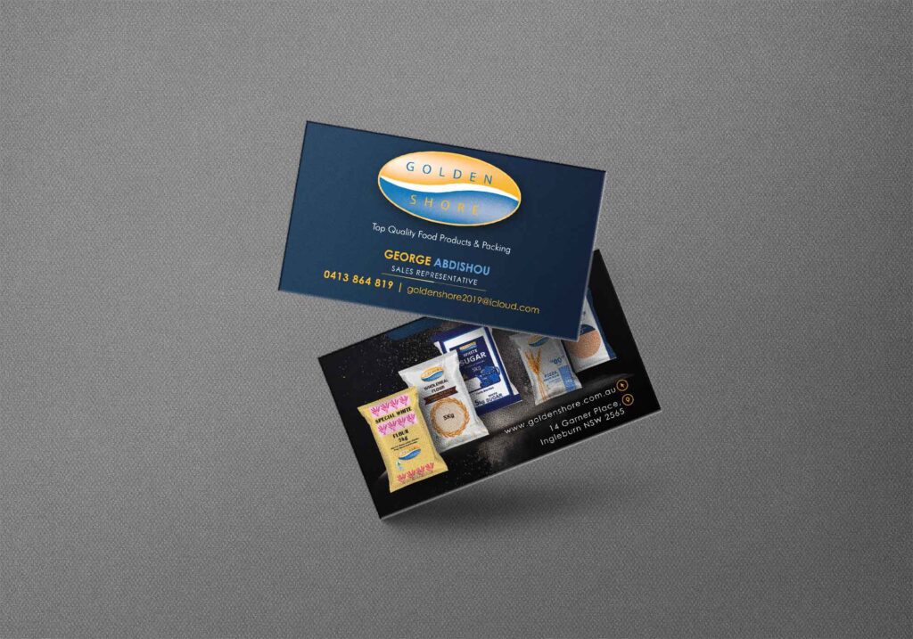
As of today, our creative team has crafted a business card that embodies the ethos of an iconic Australian food brand, capturing the juxtaposition of tradition and modernity within its aesthetic.
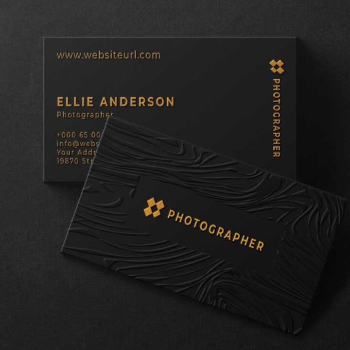
Crafting Compelling Business Cards
A business card stands as a tactile ambassador for your brand, weaving together design elements that evoke the right sentiments and business ideologies. Carefully chosen colours and textures can create an ambiance of sophistication, suggesting a narrative of quality and care that’s parallel to your brand’s ethos.
In creating a business card that is both memorable and effective, one must employ design that resonates with the desired audience, serving as a “silent salesperson”. A business card should not merely be a medium for contact details but rather a testament to a brand’s identity, marrying visual appeal with the brand message. In this case, the aesthetic is seamlessly aligned with the narrative of premium food products, ensuring every time it is shared, it conveys the excellence and reliability synonymous with the brand.
Emphasising Brand Identity
In the realm of premium food products, a business card must articulate the brand’s legacy of quality. Gold and blue hues manifest sophistication, triggering associations with luxury and the sea’s expanse.
It’s about more than just a name; it’s a display of heritage and excellence. The brand’s colours are deeply intertwined with its values, encapsulating a promise of quality that’s eternally bonded to its identity.
Gold signifies opulence, whilst blue echoes trust—core sentiments that underline our brand’s esteem.
The business card design for the food brand’s sales representative becomes a quintessential extension of this narrative. Blending the company’s golden logo and azure tones with product imagery, the card crystallises the brand’s essence, ensuring that each exchange leaves a lasting, distinctive impression.
Choosing the Right Material
Selecting a premium card stock is essential for reinforcing the brand’s message of quality and heritage. A thicker, more luxurious paper stock will inherently communicate a sense of superiority and durability, echoing the brand’s commitment to excellence.
Heavyweight uncoated papers exude elegance and professionalism, ideal for our business card.
Opt for a matte finish to enhance the rich gold and blue tones, ensuring legibility and enhancing tactile interaction—a nod to the sensory experience tied to the brand’s food products.
A card with a high GSM (grams per square metre) will not only feel more substantial but will also resist wear over time, retaining its pristine appearance longer.
Consider incorporating a subtle texture, akin to the fine grains of the products, to create a distinct tactile experience that resonates with the tactile nature of our food offerings.
Lastly, to underscore the brand’s attention to detail, select a material that supports high-definition printing. This will ensure clarity for intricate designs and crispness for the contact details, reflecting the brand’s high standards.
Incorporating Essential Information
In the realm of business card design for a representative of one of Australia’s premier food brands, it is paramount to include essential contact details. These are to consist of the name, position, direct telephone line, and email address, enclosed within an elegant design that complements the sophisticated palette and imagery. The information should be arrayed in a manner that maintains readability while showcasing the finesse symbolic of the brand’s reputation for quality food products.
The inclusion of the company’s URL, meanwhile, should be deftly incorporated into the design, serving as a portal for deeper brand engagement. This digital touchpoint encourages an immediate connection, guiding potential partners toward a comprehensive understanding of the extensive product range and the brand’s Australian heritage.
Balancing Aesthetics and Details
Crafting a sophisticated business card demands careful calibration between visual allure and the conveyance of pertinent details.
In 2021, design sensibilities have evolved to favour minimalism, yet a representative of a prestigious food brand must combine this with sumptuous visual cues, thus necessitating a fusion of simplicity and complexity. This balance ensures that the card is not only a beacon of elegance but also a robust vehicle of communication.
When integrating the brand’s illustrious gold and blue insignia, one must tread a delicate line to prevent overpowering the essential information. The colours should enrich the design without causing a visual cacophony that detracts from the user’s ability to parse contact details and brand messaging swiftly.
Furthermore, the high-quality finish of premium card stock accentuates the golden hues and maritime blues, articulating a tactile distinction that resonates with the premium nature of the brand’s offerings. Here, the physicality of the card becomes an extension of the brand experience.
The reverse side serves as a canvas for creativity, where images of the food brand’s diverse product range can be displayed in a manner that whispers luxury and invites further exploration, completing a design that balances aesthetics with the critical details of a business interaction.
Selecting the Optimal Typeface
Choosing the right font is critical for brand coherence and recognition. It must reflect the brand’s premium stature and the legibility of contact details.
Since 2016, designers have favoured typefaces that blend personality with functionality. The type selected must harmonise with the golden and blue logo, enhancing rather than competing with it.
Ideally, the typeface should echo the brand’s ethos of quality and reliability. It must be classic yet contemporary, ensuring readability while whispering sophistication and class.
For this particular food brand, a serif font might be most apt, providing a nod to tradition while maintaining modernity. Importantly, it should complement the imagery without overshadowing the critical information conveyed.
Selecting a suitable font ensures the card’s design is not diluted, maintaining the integrity and purpose of this tactile piece of marketing collateral.
Creative Use of Visuals and Colour
The judicious application of visuals augments the card’s allure, thoughtfully integrating the emblematic gold and cerulean hues. These tones, emblematic of ocean and harvest, evoke a narrative of natural abundance and culinary excellence. Distinctive graphics, tailored to encapsulate the diverse product range, resonate with the card’s rear, transforming an ordinary contact medium into a sensorial brand showcase.
Synchronicity between colour schemes and corporate identity solidifies the card’s visual impact. Gold accents underscore the premium aspect of the brand, while the azure reflects trust and dependability. Seamless integration of colours and imagery assures not just a card, but a testament to the brand’s ethos.
Colour Psychology in Design
Incorporating colour psychology is pivotal in eliciting specific consumer responses and reinforcing brand messaging.
- Blue symbolises trust, security and tranquillity, often used to establish a sense of reliability.
- Gold conveys luxury, quality and achievement, aligning with a brand’s premium positioning.
- White represents simplicity, purity and minimalism, providing a clean backdrop that highlights other elements.
Utilise colours strategically to embody the brand’s ethos and evoke the desired emotional response.
Consistent use of these psychological cues ensures a cohesive and sophisticated representation of the brand’s identity.
Integrating Graphics and Images
Integrating graphics and images effectively communicates a brand’s identity and product offerings. Carefully selected visuals encapsulate the company ethos, instantly conveying key messages to potential connections.
For this Australian food brand, graphic elements must resonate with its reputation for quality and variety. The inclusion of high-resolution pictures of products on the reverse communicates an artisanal, sensory experience, catering to the culinary enthusiast.
Images are meticulously curated to showcase flour, rice, and other staples, evoking the freshness and authenticity central to the brand. These visuals are juxtaposed with the logo, tying together the narrative of premium, Australian-made produce.
Borders and spacing are engineered to frame the images, ensuring they complement rather than overwhelm the fundamental details. This design strategy respects the cognitive load of the viewer, prioritizing aesthetics alongside information accessibility.
Careful balance is struck between imagery and the functional space for contact details. The visual ensemble works synergistically, driving brand recognition and leaving a memorable impression.
Examples to Inspire
Peruse our exquisite business cards, where the fusion of functionality and aesthetic appeal becomes apparent. The front boasts the brand’s logo, its golden hue shimmering against a sophisticated blue backdrop, epitomizing the richness of the sea and the purity of the white in between. Turning the card reveals a tableau of premium food products—alluring images of flour bags, rice grains, and sugar crystals, spotlighting our commitment to quality. Each image is meticulously chosen to represent the brand’s extensive offerings, ensuring that every card recipient is captivated by the prospect of creating delectable meals with these Australian-made ingredients.
Innovations in Card Design
Functionality meets avant-garde artistry in business card design.
In the ever-evolving realm of graphic design, the business card stands as a testament to innovation and creativity. Each card serves not only as a conduit for essential contact information but also as a portable billboard, an embodiment of the brand’s ethos. Advances in design technology allow for an unprecedented level of detail and customization, from textured finishes to interactive elements that engage and intrigue the recipient. It becomes less about a mere exchange of details and more about an immersive brand experience.
One must consider the psychology behind colour and material choices.
Modern business cards no longer confine themselves to paper – they evolve and adapt, incorporating eco-friendly materials and smart technology. Thus, intertwining sustainability with convenience, these innovative cards ensure your business stays at the forefront of the recipient’s mind.
The palate of possibilities expands as we incorporate cutting-edge techniques.
We harness the latest advancements in printing and material science, integrating features like NFC chips for digital handshakes and AR layers for dynamic content, ensuring your business card remains relevant in the continually shifting landscape of 2023 and beyond. These innovations serve not just as a conversation starter but as a tangible illustration of a forward-thinking and technologically adept business identity.
Successful Sydney Business Card Cases
In the realm of culinary representation, impact and tasteful design must merge seamlessly into a business card. Our recent work for a distinguished Sydney-based food brand encapsulates this principle with a tangible allure that truly captures the essence of their premium offerings.
Adopting the brand’s sophisticated colour palette, we crafted cards featuring a golden logo set against a deep blue, evoking the richness of the sea, framed within a crisp white oval. On the reverse, a collage of their food products illustrates both variety and quality, entwined with gold and blue lettering detailing key contact information. This design approach not only upholds the brand’s prestige but also serves as an enticing visual menu of their products.
Furthermore, the card’s material selection was pivotal in conveying the brand’s commitment to excellence. Utilising a premium cardstock with a textured finish, the card exudes a sense of luxury and quality that aligns with the brand’s promise of reliability and satisfaction. Subtle embossing accentuates the brand’s logo, giving it a tactile dimension that invites touch and closer inspection, enhancing retention.
Lastly, the business cards were engineered to embody the corporate philosophy that marries tradition with innovation. By incorporating a QR code discreetly positioned to complement the overall design, we bridged the gap between physical and digital realms. This element not only directs clients to further engage with the brand online but serves as a nod to the company’s embrace of technology, ensuring a comprehensive and memorable brand encounter.
Affordable Excellence in Business Card Design
RooVista Designs stands out as your go-to destination for affordable business card graphic design. At just $30 per hour, our services are budget-friendly, ensuring that small businesses in Bankstown, Canterbury, Blacktown, Glenmore Park, Penrith, Blue Mountains, and Greater Western Sydney can access top-notch business card designs without compromising quality.
In addition to serving the local community, RooVista Designs extends its reach to cater to clients across Australia through our convenient online services. Connect with us effortlessly through WhatsApp and Google Meet, where our skilled team is ready to collaborate with you, irrespective of your location. Whether you’re in Sydney, Melbourne, Brisbane, Adelaide, Perth, Canberra or any other part of the country, RooVista Designs is dedicated to bringing our innovative menu design solutions to your doorstep virtually.
Embrace Creativity with RooVista Designs:
In the realm of business card graphic design and creative business graphic designs, RooVista Designs is your trusted partner. Our expertise extends beyond mere aesthetics – we grasp the pulse of design trends. Explore the latest in design inspiration on Pinterest and let RooVista Designs breathe life into your business card vision.