Coco Designs - Logo Design

Coco-Designs-Logo-Design – RooVista Designs
In the tapestry of the fashion industry, each brand weaves its unique thread, creating patterns that evoke emotions and tell stories. How does a logo capture the essence of such a narrative?
Let us unpack this mystery.
RooVista Designs endeavoured to embody the ethos of Coco-Designs’ commitment to eco-conscious fashion. Through colour and symbolism, a visual narrative was born.
Crafting Coco-Designs Identity
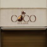
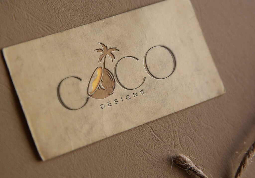
In the realm of sustainable style, Coco-Designs emerges as a beacon of environmental stewardship, necessitating an emblem that encapsulates this noble purview. Employing a palette that whispers of the earth’s natural tones, RooVista Designs curated a logo that mirrors the brand’s devotion to green materials and ethical fashion tapestries. The selection of a subdued light brown hue not merely signifies a connection to our terrestrial roots but also resonates with the authenticity that Coco-Designs espouses.
Akin to the first shoot awakening in a germinating seed, the Coco-Designs logo envisages regeneration and fresh beginnings. Blending the organic symbol of a split coconut alongside a pictorial representation of tender life, RooVista Designs crafted an emblem that conveys the brand’s enduring narrative—embracing both the resilience and delicacy inherent in nature’s cycle. This dichotomy, captured in a simple yet profound visual statement, evokes a sense of harmony, growth, and the blossoming of a sustainable future in fashion.
Earthy Tones: Brand’s Ethos
Intrinsic to our ethos, light brown hues embody the earth—echoing Coco-Designs’ allegiance to sustainable fashion principles.
The coco-de-mer inspires the logo, its rare seed emblematic of Coco-Designs’ commitment to unique, earth-friendly fashion.
Coco-Designs’ identity is vividly reflected through the logo’s color palette, where earth meets fashion, and beginnings blend with enduring values.
The split coconut and tender shoot symbolise not just new beginnings, but an unwavering connection to our planet’s life-giving essence.
Integrating Green Ideals
In the arena of graphic symbolism, the integration of green ideals is not merely a statement—it’s a commitment to a lifestyle and ethos that resonates deeply with environmentally conscious consumers. Representing Coco-Designs, the chosen motifs and color palette weave an intricate narrative of ecological awareness and fashion thrust towards sustainability.
Discerning clients recognise the gravitas of green materials in contemporary design landscapes. With Coco-Designs, this gravitas is captured eloquently in their brand emblem.
Significantly, the logo’s centrepiece—a split coconut—mirrors Coco-Designs’ dedication to eco-friendly processes, symbolising life’s perpetual rebirth (sustainability weaving through their creations) and the cyclical nature of our environment.
Visual elements within the logo embrace green initiatives without forgoing aesthetic appeal; the tender shoot of life, juxtaposed with the durable coconut shell, narrates sustainability with visual finesse, proclaiming Coco-Designs’ philosophy with clarity and impact.
Each detail has been tailored to illustrate the company’s journey towards a greener fashion industry, adopting light brown as a reminder of the brand’s deep-rooted connection to nature, and their allegiance to the preservation and celebration of our planet’s resources.
Ultimately, the design speaks to Coco-Designs’ core aim to harmonise fashion with eco-friendliness. Through expert graphic representation, the logo achieves this balance, offering a compelling visual story of a brand devoted to nature’s well-being and aesthetic innovation.
Symbolism in Coco-Designs
In the intricate tapestry of Coco-Designs’ logo, light brown hues are expertly woven to represent the brand’s intimate bond with the earth. This subtle yet profound palette choice reflects a philosophy deeply ingrained in the fabric of the company, honouring the organic and the enduring. The use of light brown not only signifies soil fertility but also symbolises the brand’s commitment to earth-centred practices, delicately weaving their environmental ethos into the visual narrative.
Moreover, the emblem’s focal point, a sprouting coconut, embodies the genesis of new beginnings – one that is resonant with Coco-Designs’ innovative spirit. The depiction of the coconut, split to reveal tender life, stands as an allegory for the company’s eco-centric ideology and their unwavering dedication to sustainable fashion. It asserts their narrative with a clarity that speaks to both heart and mind, poignantly capturing the essence of renewal and the transformative power of nature-aligned design principles.
Split Coconut: New Beginnings
The split coconut in Coco-Designs’ logo heralds the dawn of eco-conscious fashion. It illustrates the emergence of new life, representing the vitality of sustainable choices in the industry.
Within this emblematic cocoon of creativity, the coconut is more than a mere symbol; it’s a vibrant statement of purpose. It celebrates the rebirth of materials, transforming what was once discarded into the very fabric of high fashion, resurrecting waste into wearable art.
The vibrant green shoot bursting forth is a testament to innovation in environmental stewardship. It signifies Coco-Designs’ commitment to nurturing green ideas into flourishing trends that redefine the boundaries of eco-friendly attire.
Concurrently, the nurturing brown cocoon encapsulates this tender shoot, underscoring the protective environment that Coco-Designs fosters for new concepts. In their world, every sustainable idea has a sanctuary to thrive and inspire.
Such potent imagery invokes a narrative of hope, challenging the status quo with a vision of a fashion industry reborn from the roots of responsible creation.
Tender Leaf: Sustainable Growth
The tender leaf element in the Coco-Designs logo epitomises the nascent stages of sustainable development.
- Youthful Vitality: Represents the innovation and fresh perspectives in sustainable fashion.
- Green Choices: Symbolises the environmentally conscious decisions and practices of the company.
- Growth Potential: Indicates the possibility of expansion and evolution within sustainable parameters.
- Evergreen Ideals: Stands for the timeless value and continuous relevance of eco-friendly principles.
In essence, it’s a visual promise of Coco-Designs’ commitment to ecological responsibility.
This emblematic sprout reflects a harmonious balance, pairing youthful vibrancy with longevity in sustainable design.
Logo Development Journey
Embarking on the creative expedition for Coco-Designs’ logo, the need to encapsulate their core ethos of eco-friendliness and sustainable fashion was paramount. The chosen palette gravitates towards the earthy tones, with light brown serving as a foundational hue, reinforcing the brand’s intrinsic link to nature and its resources. Critical to the logo’s narrative is the split coconut, an emblem of nourishment and life’s essence, which resonates with the brand’s philosophy of natural regeneration and ethical material utilisation. In its entirety, the visual identity stands as a beacon for new beginnings, much like the tender leaf that symbolises growth and the promise of a greener tomorrow within the fashion industry.
Conceptualising Eco-Friendly Fashion
The visual identity of Coco-Designs converges on the ethos of environmental stewardship within the fashion sphere.
- Split Coconut: Emblematic of life and nourishment, synonymous with ethical regeneration.
- Tender Leaf: Symbolises new beginnings and sustained growth within the ecosystem.
- Light Brown Hue: Represents the Earth, evoking the brand’s commitment to natural materials and processes.
At its core, this imagery forms a compelling narrative of sustainability and ecological responsibility.
Through design, Coco-Designs expresses a deep alignment with nature, crafting an aesthetic that resonates with eco-conscious consumers.
Design Elements Fusion
The chosen palette of light brown creates an immediate association with the earth, signifying a grounded presence within an industry often critiqued for its environmental impact. It reflects the brand’s ethos of natural material usage and low environmental footprint.
A split coconut imbues the symbol with a sense of life and organic origin, a testament to the sustainable materials utilised by Coco-Designs.
Integrating the tender leaf element epitomises the brand’s commitment to new beginnings, representing hope and the continued journey towards a more sustainable future within the intricacies of fashion. The leaf’s delicate appearance harmonises with the robust coconut, illustrating the balance between strength and finesse in eco-friendly design.
The interplay between these symbols culminates in a logo that is not merely a representation of fashion’s ecological potential, but also a commitment to positive change. Through thoughtful selection and combination of these elements, the logo becomes a visual manifesto, projecting Coco-Designs’ vision of harmony between fashion and nature. This harmonisation encapsulates the essence of a brand born from a respect for the environment, designed to be timeless in both style and sustainability ethos. The logo serves as a bastion of ‘eco-chic’, inspiring both the wearer and the observer to consider the profound connection that fashion has with the natural world.
Impact of Coco-Designs Logo
The unveiling of the Coco-Designs logo, crafted by RooVista Designs, marked a pivotal moment in fashion and sustainability communication. With its infusion of light brown hues, the logo instantaneously evokes a sense of grounding, resonating with the brand’s deep-rooted connection to the Earth. The strategic integration of a split coconut symbolises rejuvenation and the birth of innovative eco-friendly fashion narratives, while the tender leaf accents underscore a commitment to perpetual growth and environmentally respectful practices. This emblem not only visually distinguishes Coco-Designs in the marketplace but also underpins its ethos, emboldening a community of conscious consumers to embrace fashion that celebrates and protects our natural world.
Market Perception Shift
Fashion is intrinsically evolving and transformative.
Historically, the fashion industry has often been criticised for its environmental impact, with stark visuals that emphasise excess and opulence. The Coco-Designs logo disrupts this narrative, aligning fashion with an environmental conscience. Herein lies a paradigm shift, imbuing each garment with a story of Earth’s stewardship. This fusion of style and sustainability illustrates a new chapter in the industry’s history.
Symbolism infuses the perception with profound meaning.
The emblem’s colour palette and iconography are consequential – they do not simply adorn but narrate Coco-Designs’ ethos. The split coconut is a beacon for renewal, and the sprouting leaf establishes the brand’s narrative—one of new beginnings, sustainable practices, and responsible innovation.
Our design fosters a deeper, emotive consumer-brand connection.
The RooVista team conscientiously conceived the Coco-Designs emblem to embody more than just aesthetic appeal. By leveraging design psychology and sustainability trends, we’ve sculpted an emblem that resonates with the zeitgeist of 2023. This forward-thinking approach establishes a rapport between Coco-Designs and a discerning clientele, propagating an era where fashion is synonymous with environmental mindfulness.
Inspiring Industry Change
The Coco-Designs logo encapsulates a paradigm of eco-conscious elegance, heralding a progressive shift in fashion norms.
- Utilising a light brown palette that evokes the earth’s natural hues
- Incorporating a split coconut emblem to signify transformative renewal
- Adding a tender sprout to represent the birth of eco-friendly practices
This emblem is a commitment etched in design, embracing a narrative of sustainability.
With every glance, the logo reminds stakeholders of Coco-Designs’ harmony with nature’s lifecycle, inspiring an industry-wide renaissance.
Your Go-To Partner for Professional Logo Design
Are you in search of exceptional graphic design services in Glenmore Park, Western Sydney, and surrounding areas like Penrith, the Blue Mountains, and Western Sydney? Look no further than RooVista Designs! We specialize in delivering captivating design solutions that elevate your brand’s visual identity and leave a lasting impression on your audience.
Graphic Design Excellence:
At RooVista Designs, we are dedicated to turning your ideas into impactful visuals. Our team excels in creating eye-catching designs that resonate with your brand and effectively communicate your message. Whether you require a stunning logo, engaging marketing materials, or a visually appealing website, RooVista Designs has got you covered.
Local Expertise with Global Standards:
What sets us apart is our unique blend of local expertise and global standards. We understand the intricacies of the local market while adhering to high-quality design principles. Our team combines creativity, technical skills, and a deep understanding of design trends to provide top-notch solutions that meet and exceed your expectations.
Hourly Charge: We offer competitive pricing with an hourly rate of $30 per hour, ensuring affordability without compromising on quality.
Service Areas: We proudly serve small businesses in Doonside, Rooty Hill, Kellyville, Glenmore Park, Penrith, Blue Mountains, and Greater Western Sydney.
Online Services: In addition to serving the local community, RooVista Designs extends its reach to cater to clients across Australia. Connect with us effortlessly through WhatsApp and Google Meet, where our skilled team is ready to collaborate with you, regardless of your location. Whether you’re in Sydney, Melbourne, Brisbane, Adelaide, Perth, Canberra, or any other part of the country, we’re here to help you achieve your design goals.
Elevate your visual presence and stand out in a competitive market with RooVista Designs. Contact us today to discuss your design needs and let us bring your vision to life!
Embrace Creativity with RooVista Designs:
In the realm of graphic design, RooVista Designs is your trusted partner. Our expertise extends beyond mere aesthetics – we grasp the pulse of design trends. Explore the latest in design inspiration on Pinterest and let RooVista Designs breathe life into your design vision.


