Skip to content
Home
About
Services
Business Card Designs
Brochure Design
Catalogue Design
Restaurant & Drive-thru Menus
Logo Design
Packaging Designs
Social Media Postage
Car Wrap Design
Signage Design
Banner Design
Portfolio
Our Pricing
Contact Us
Home
About
Services
Business Card Designs
Brochure Design
Catalogue Design
Restaurant & Drive-thru Menus
Logo Design
Packaging Designs
Social Media Postage
Car Wrap Design
Signage Design
Banner Design
Portfolio
Our Pricing
Contact Us
0493 876 994
Get In Touch
0493 876 994
Get In Touch
Home
About
Services
Business Card Designs
Brochure Design
Catalogue Design
Restaurant & Drive-thru Menus
Logo Design
Packaging Designs
Social Media Postage
Car Wrap Design
Signage Design
Banner Design
Portfolio
Our Pricing
Contact Us
Home
About
Services
Business Card Designs
Brochure Design
Catalogue Design
Restaurant & Drive-thru Menus
Logo Design
Packaging Designs
Social Media Postage
Car Wrap Design
Signage Design
Banner Design
Portfolio
Our Pricing
Contact Us
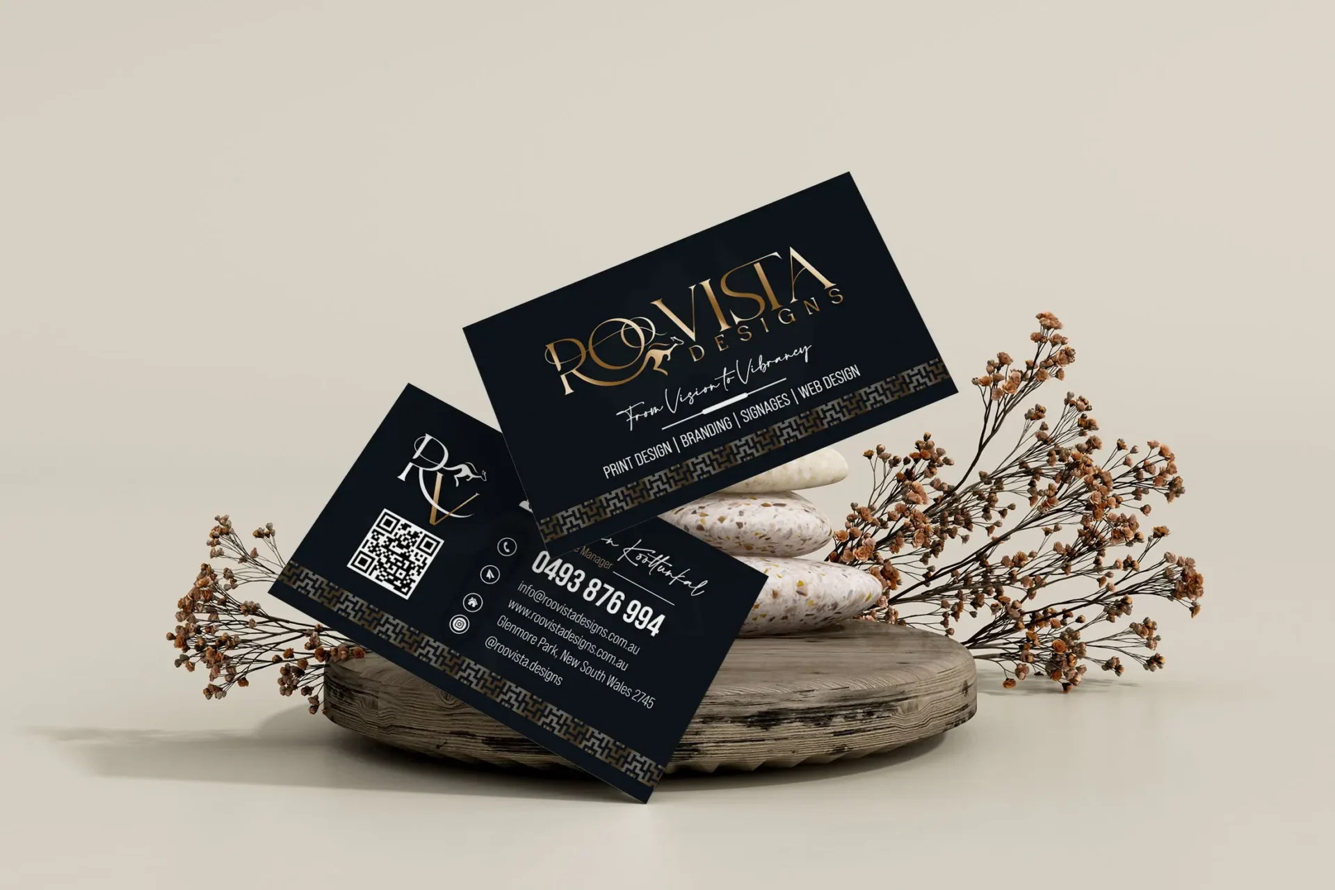
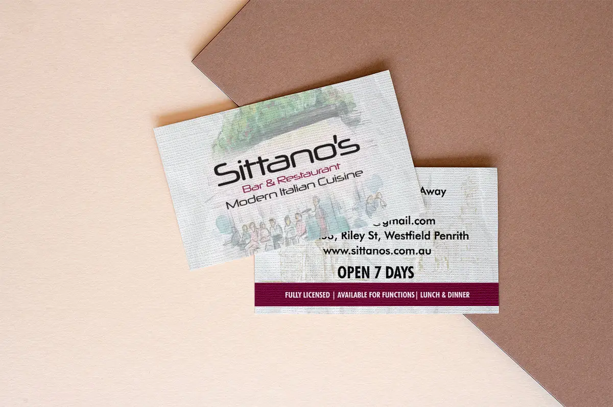
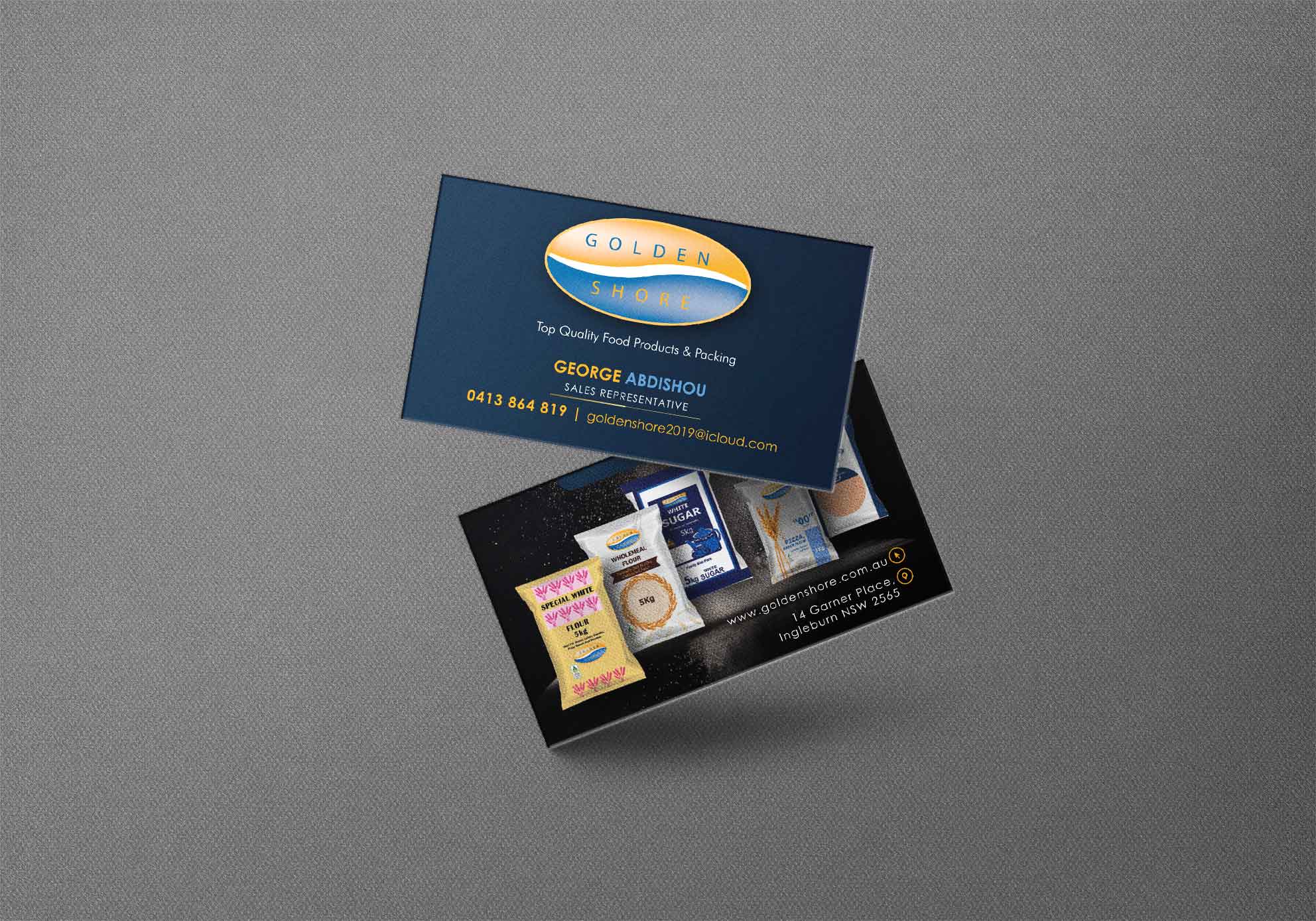
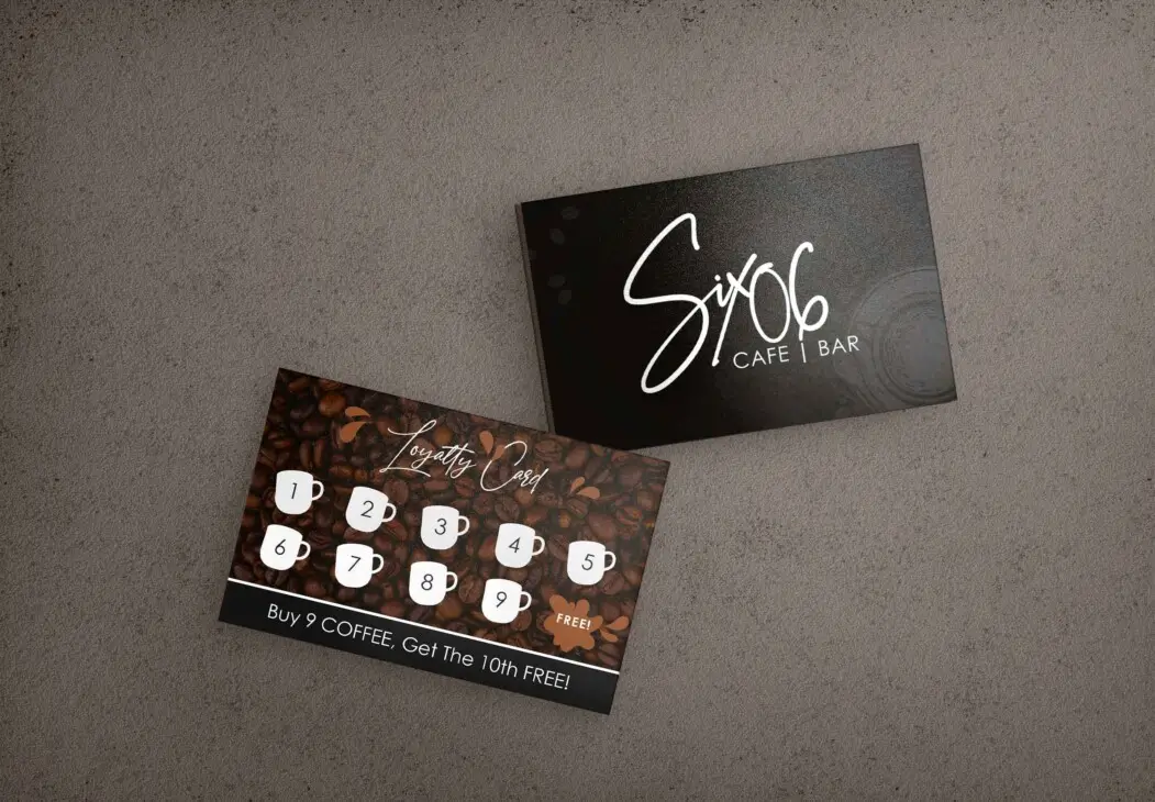
Business Card Design >>
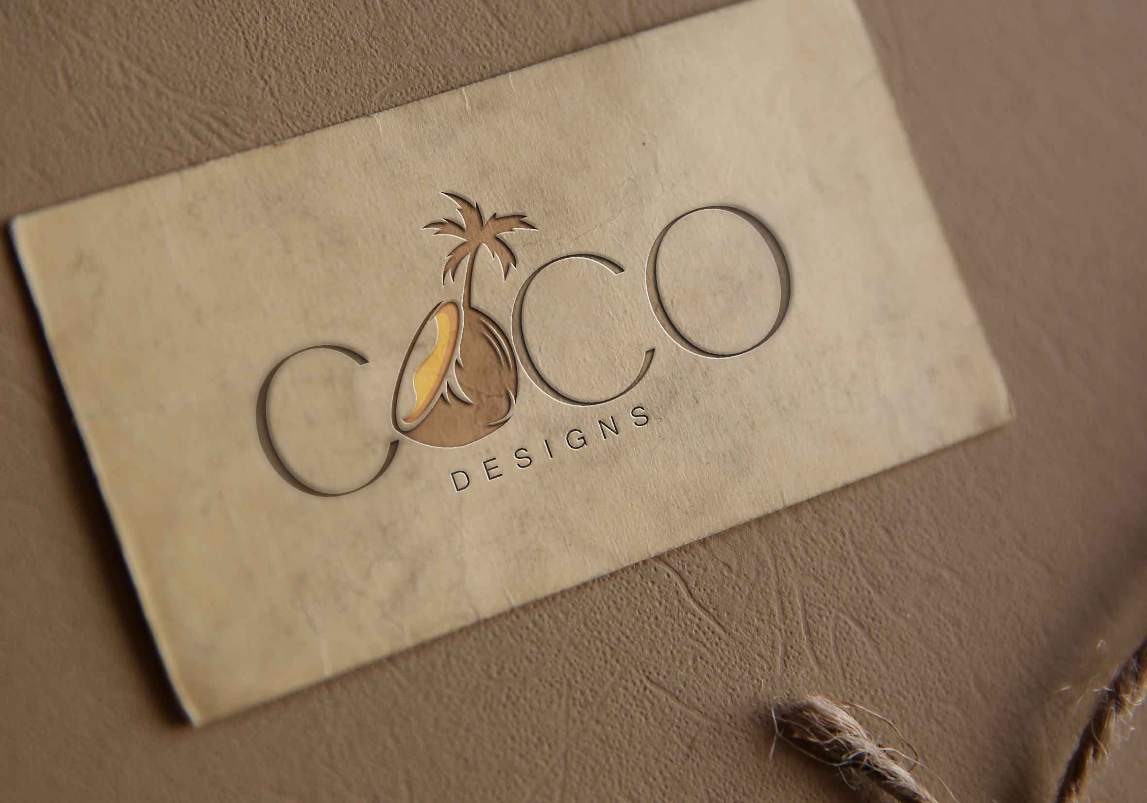
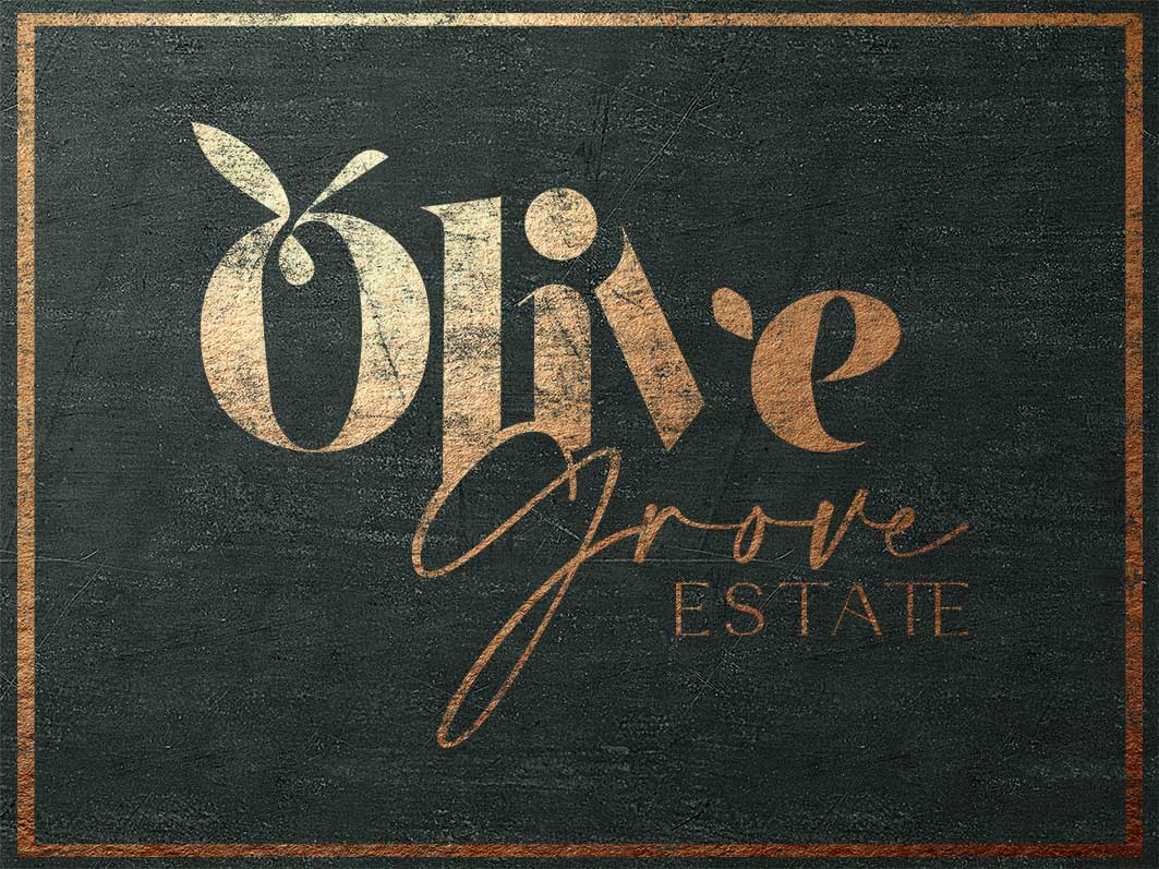
Logo Design >>
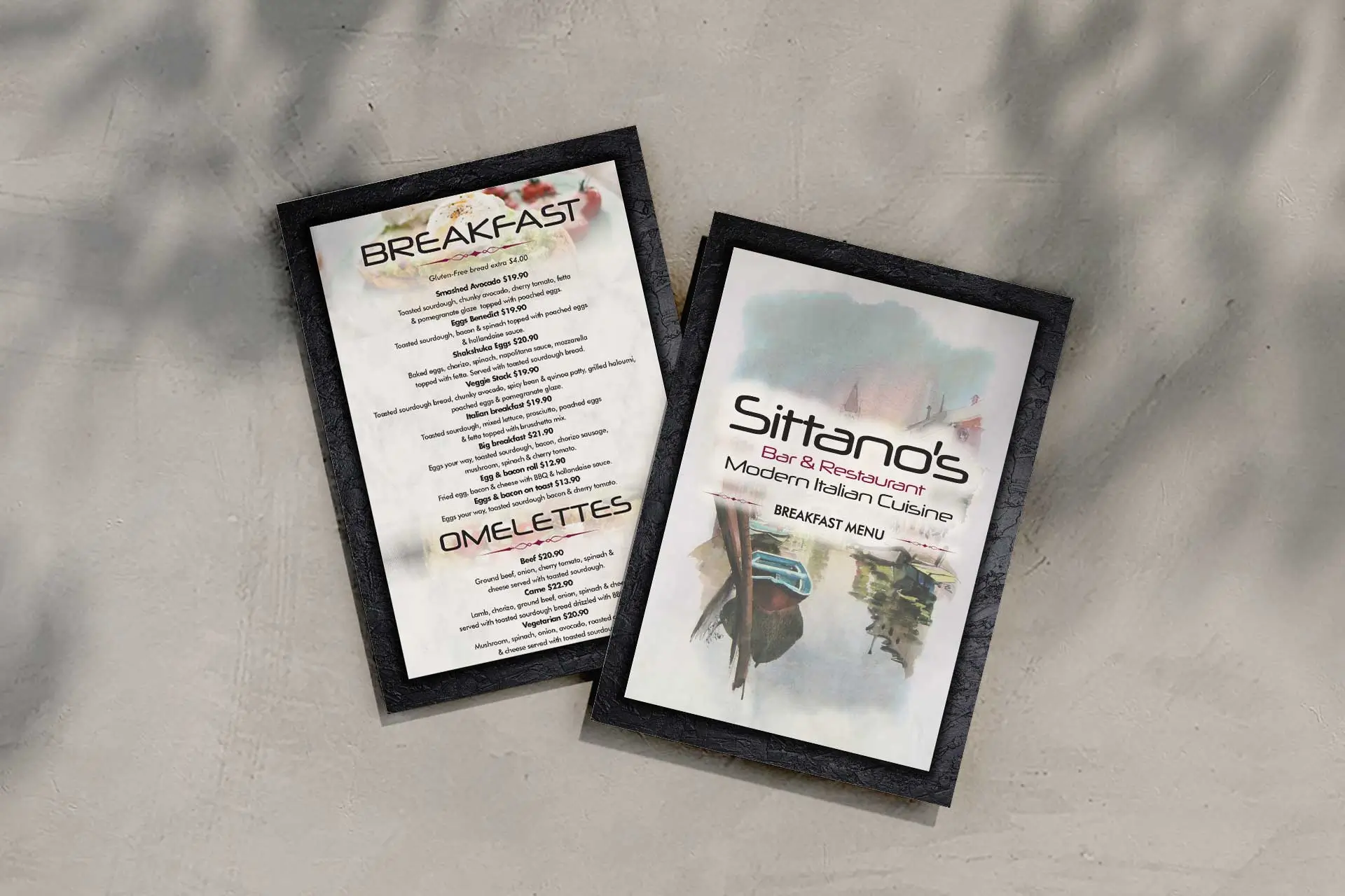
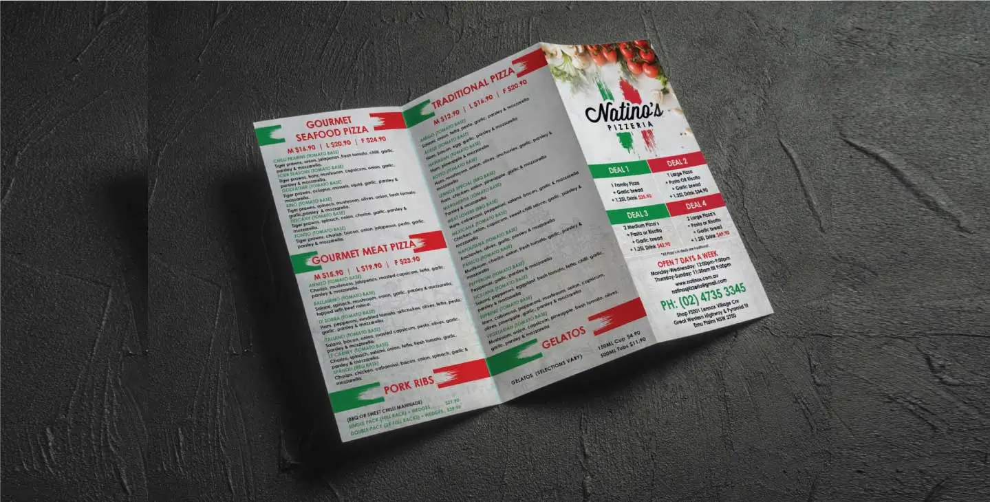
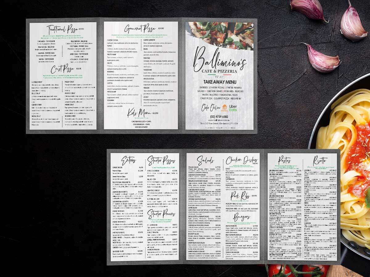
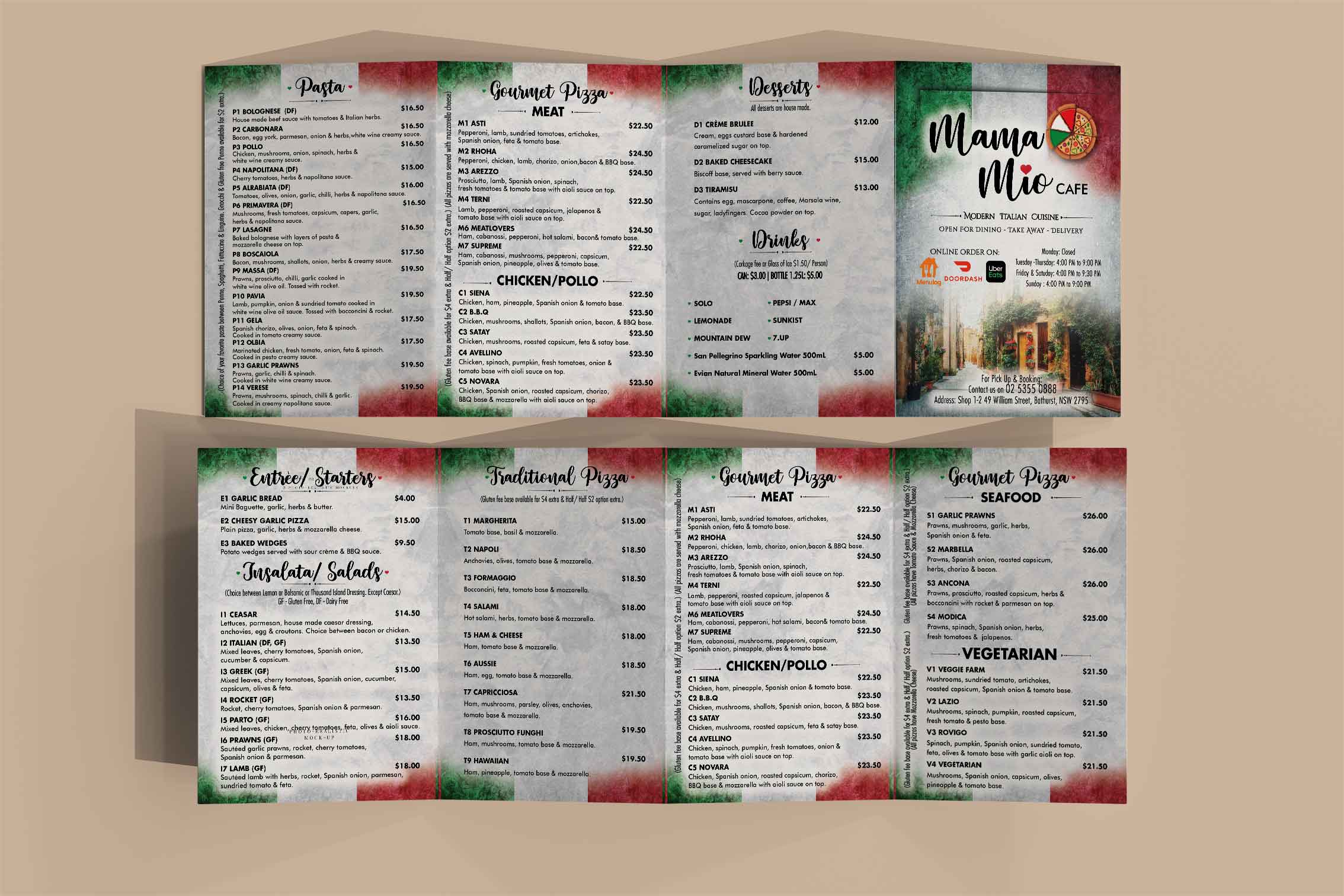
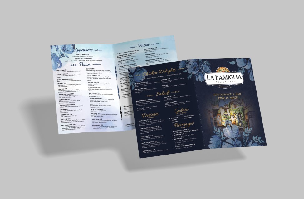
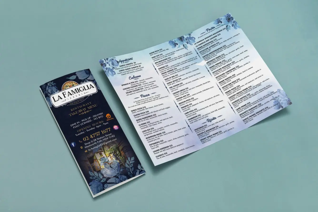
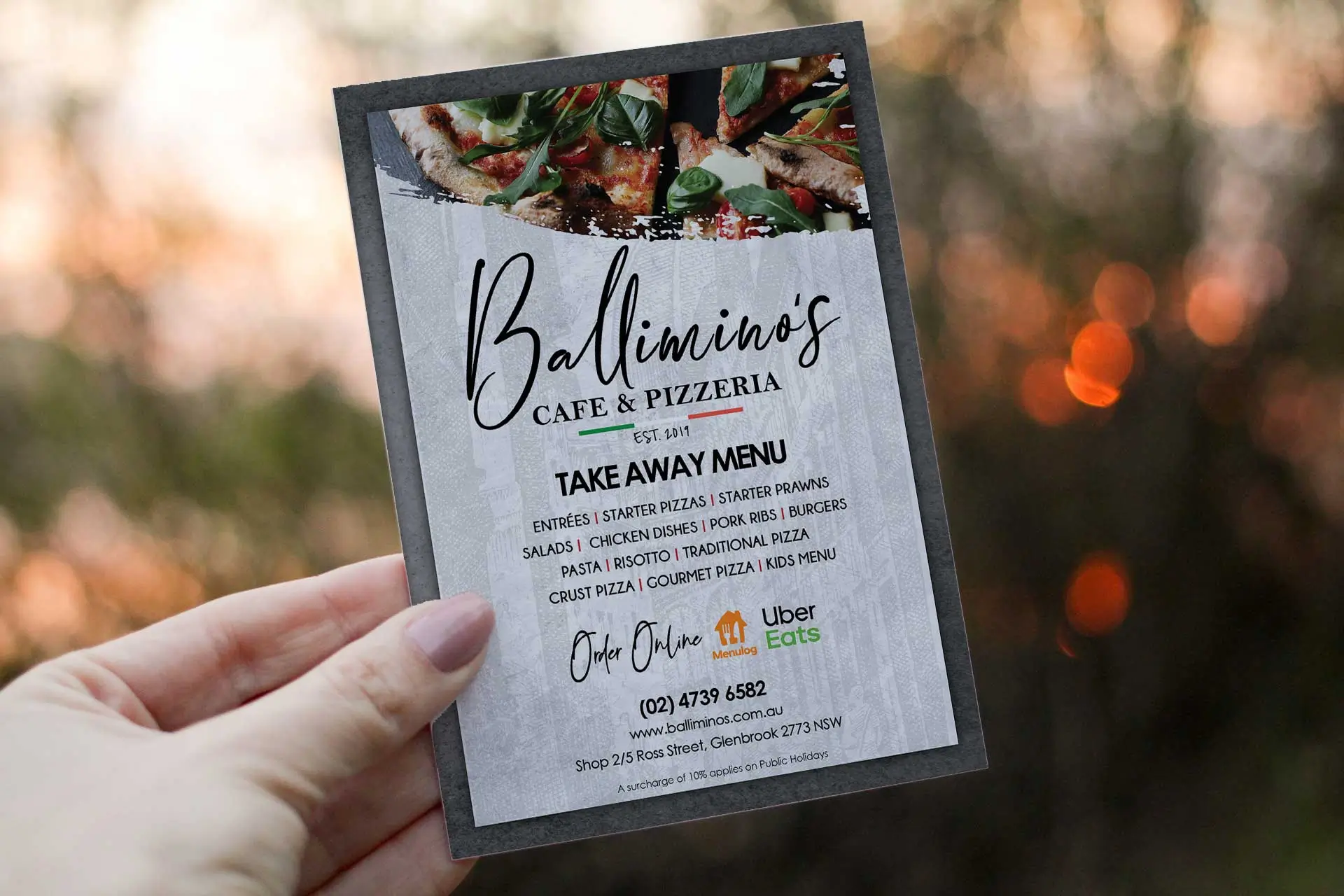
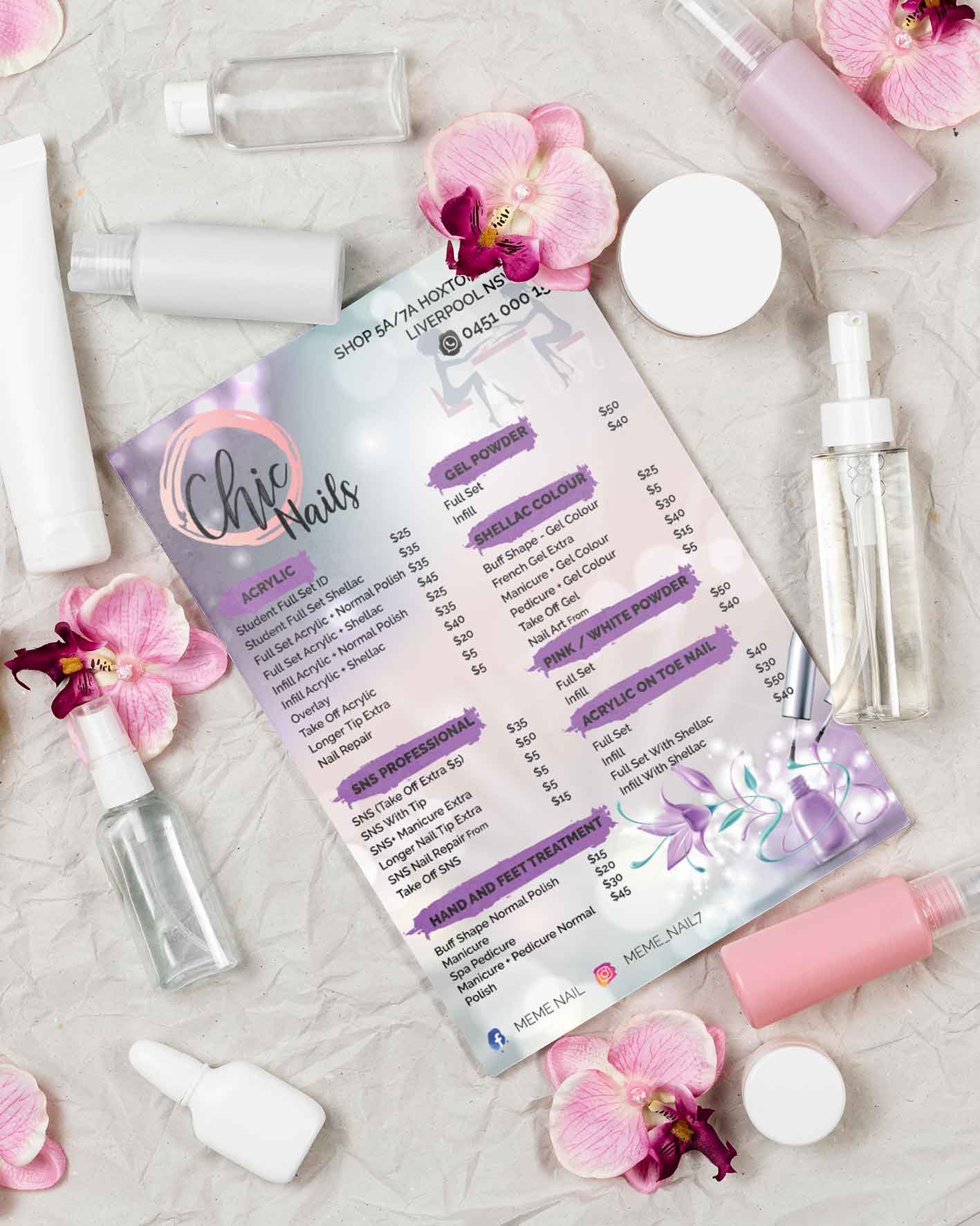
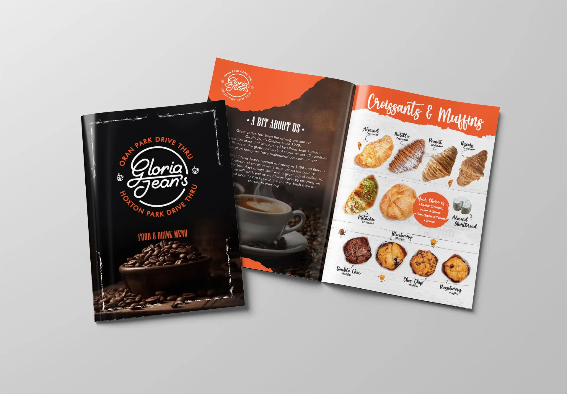
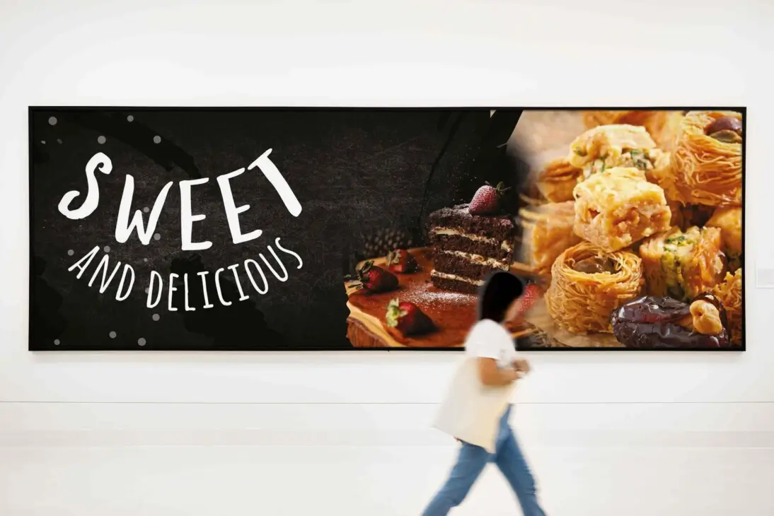
Restaurant & Drive-thru Menu Design >>
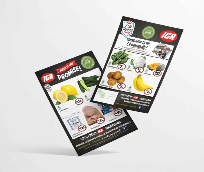
Brochure Design >>
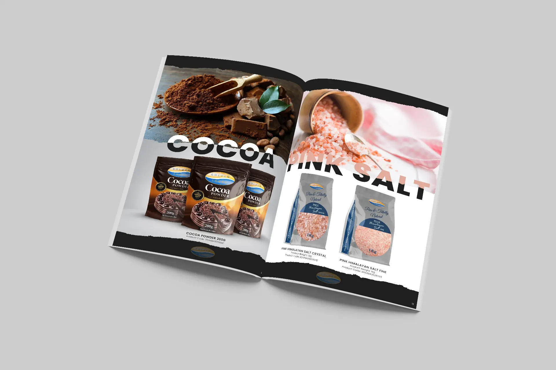
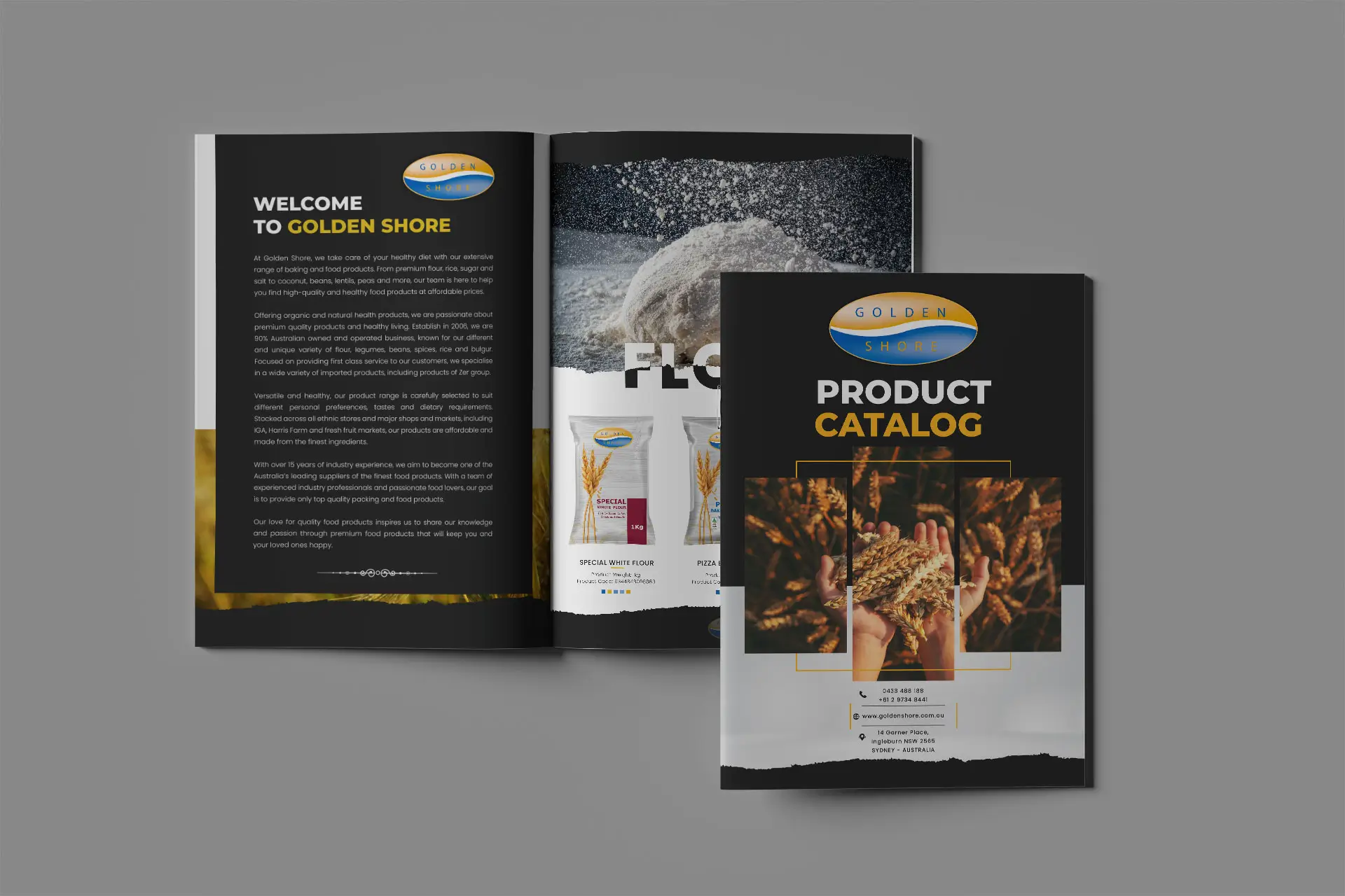
Catalogue Design
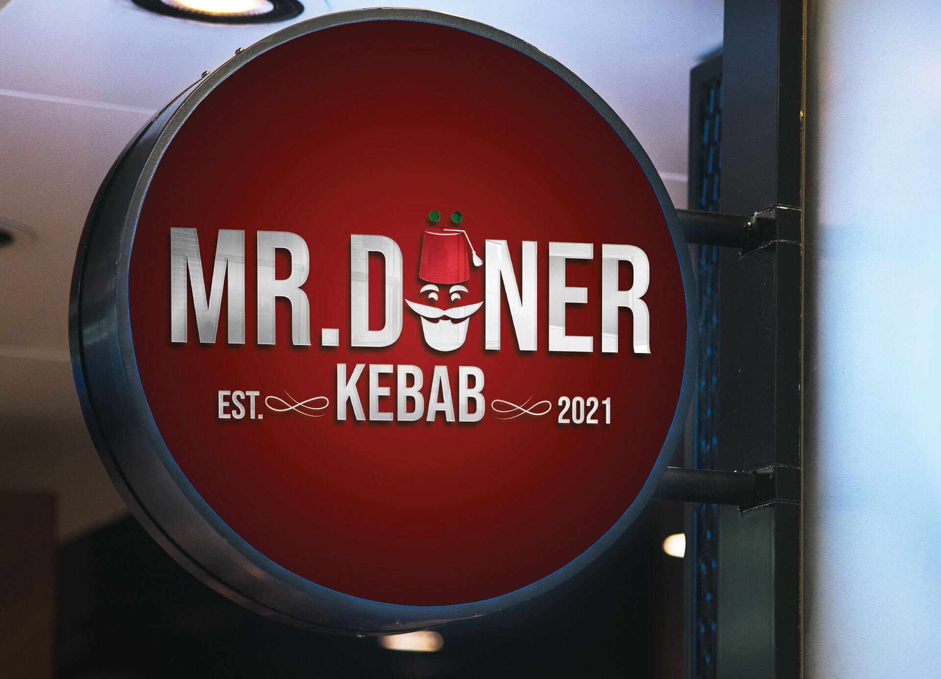
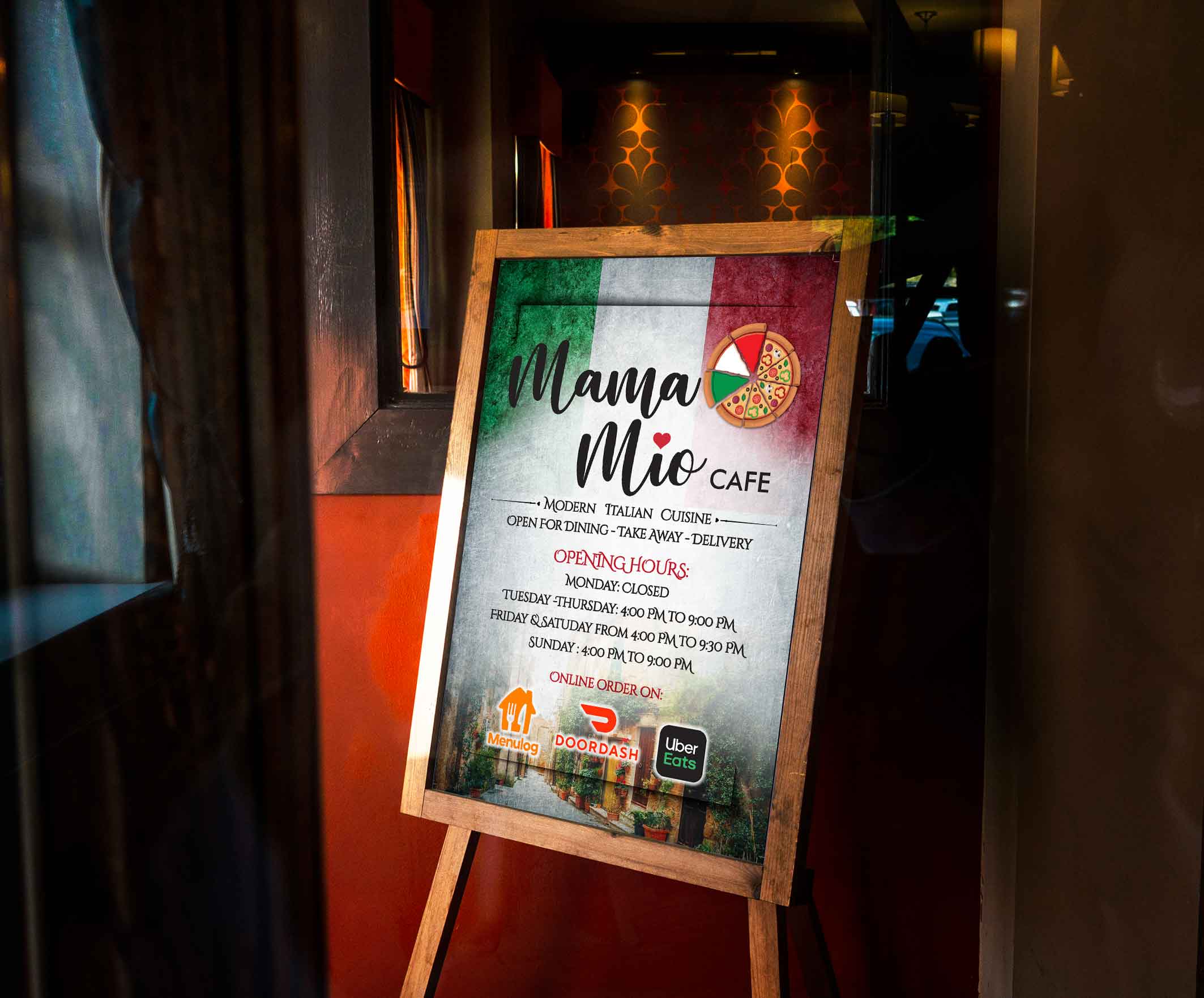
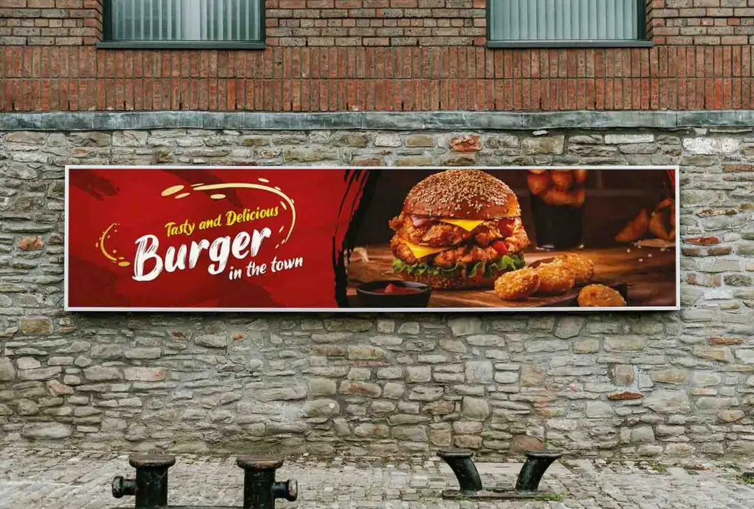
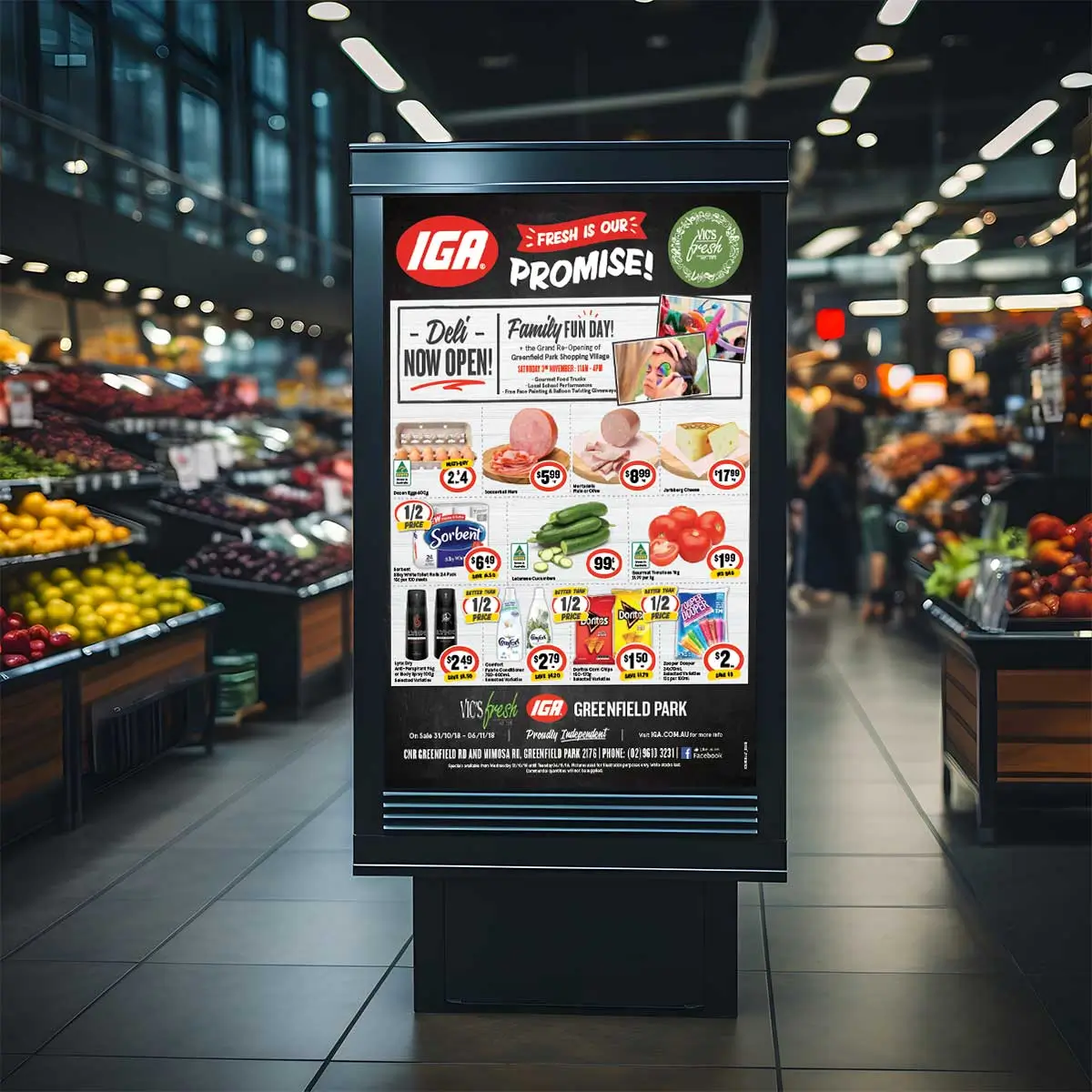
Signage Design
Optimized by Seraphinite Accelerator
Turns on site high speed to be attractive for people and search engines.

 Skip to content
  Optimized by Seraphinite Accelerator
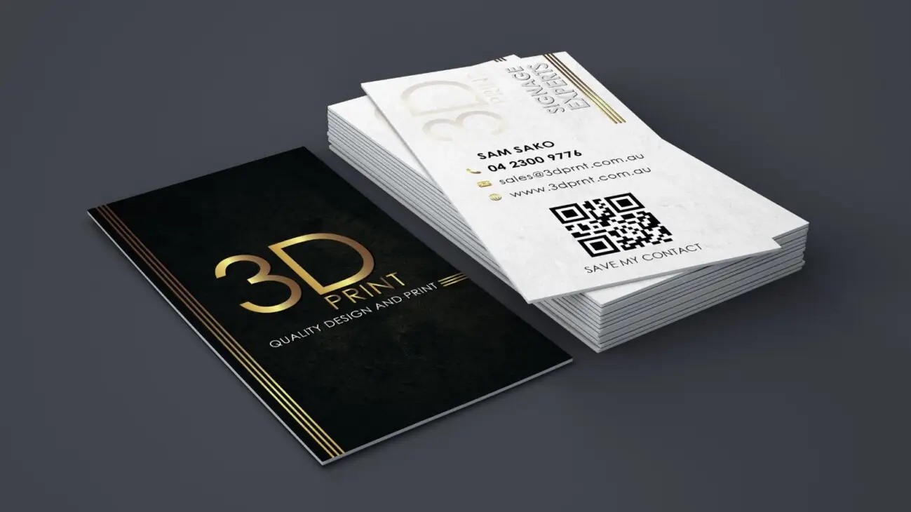